RUCA
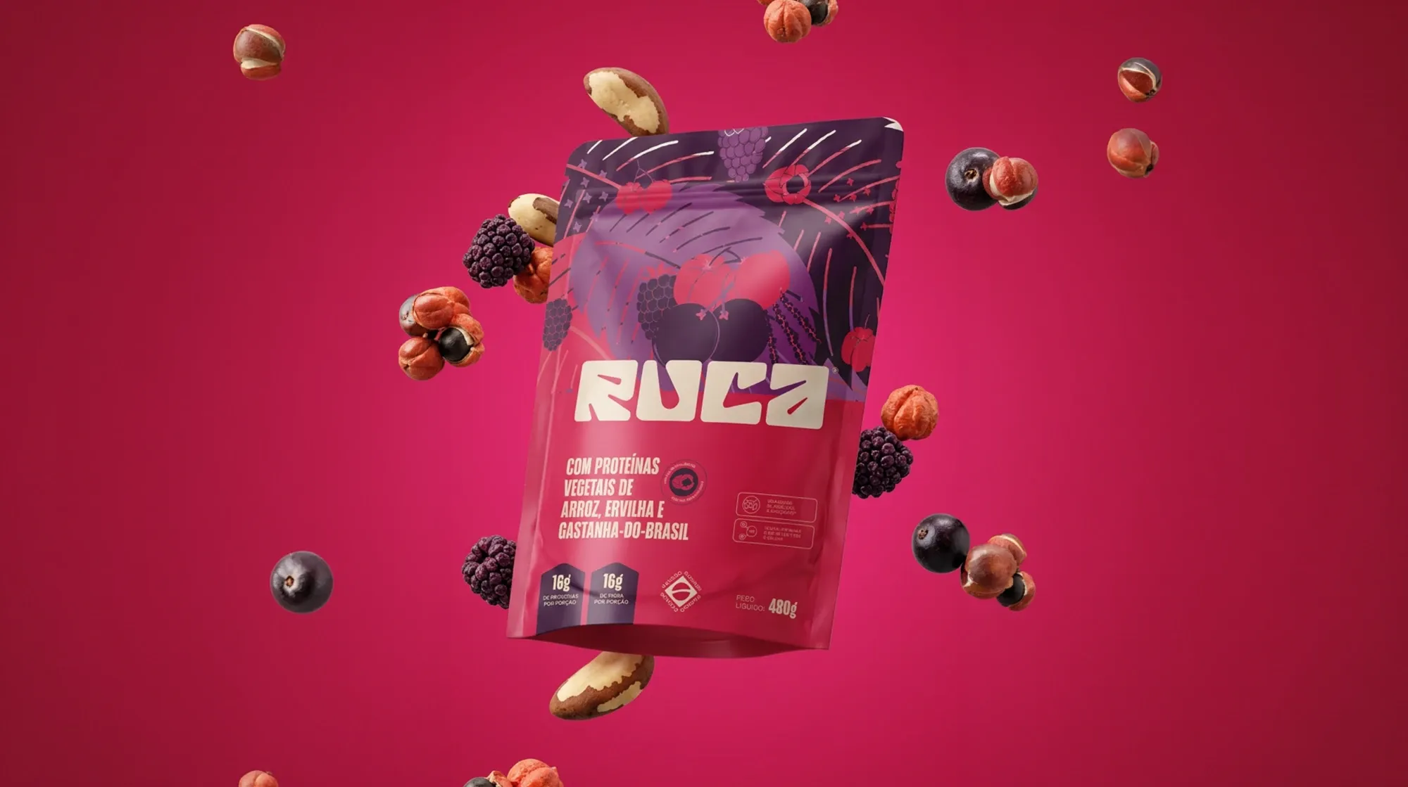
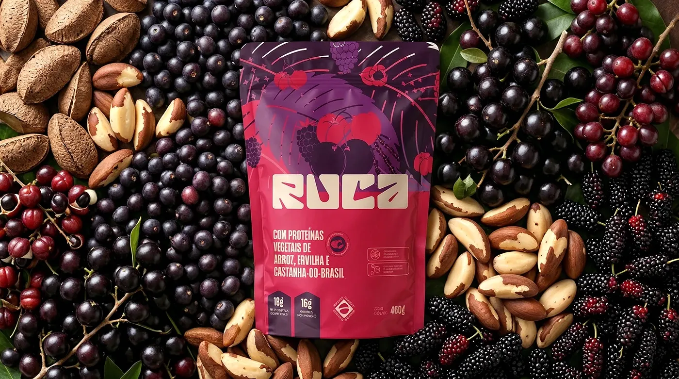
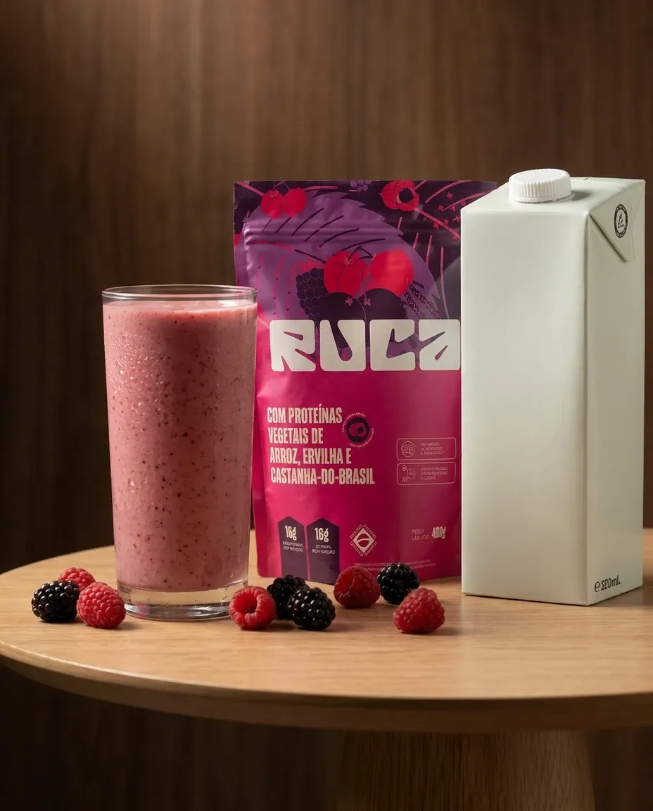
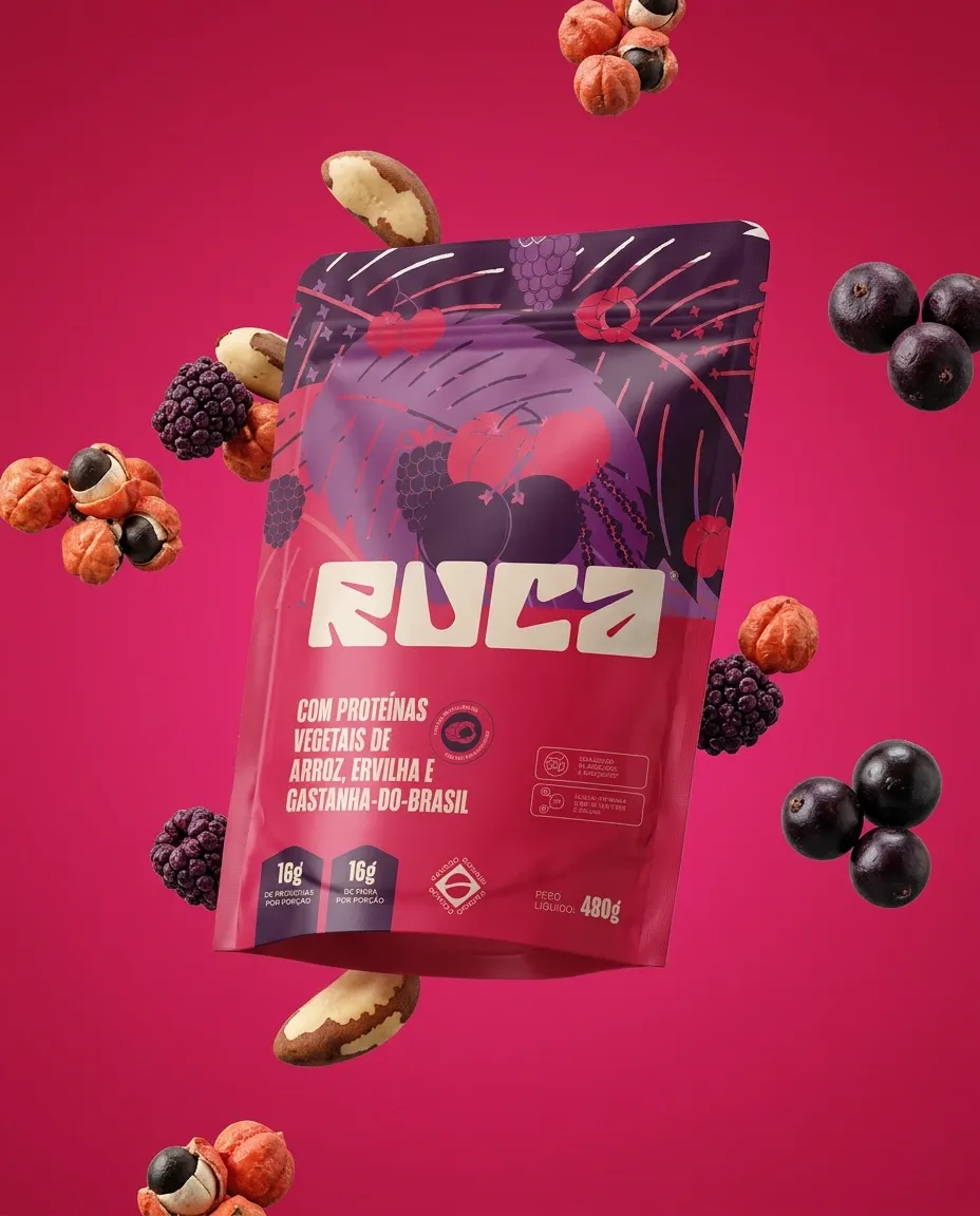
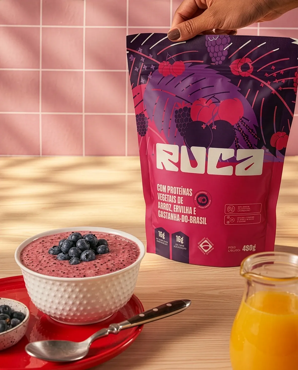
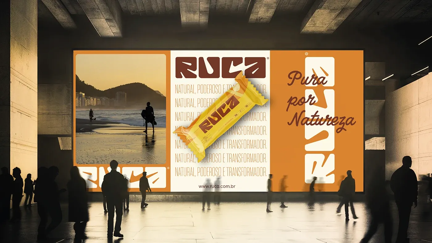
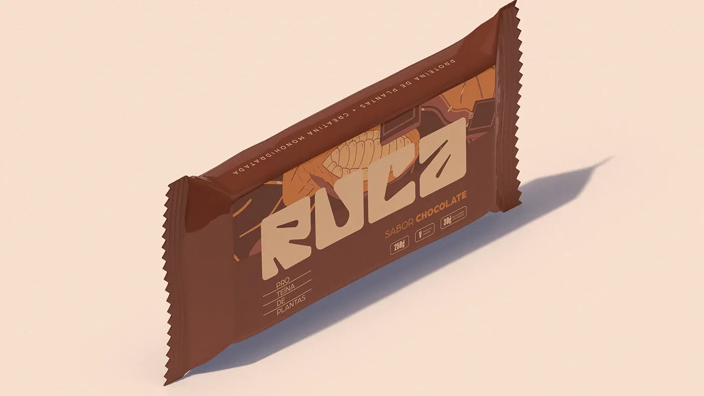
RUCA started from a simple idea: Brazilian ingredients deserved a brand that matched their richness. The challenge was to make a supplement feel like food, not medicine.
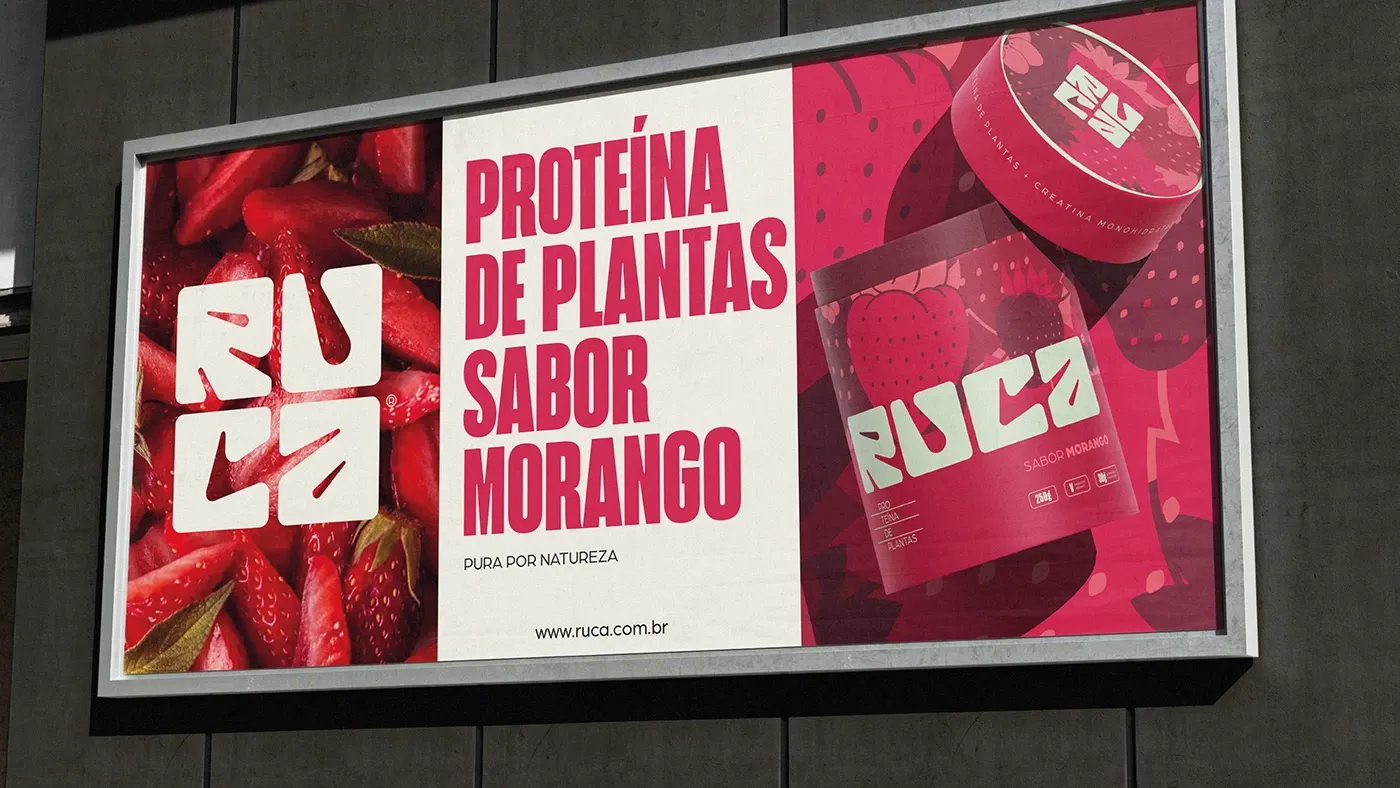
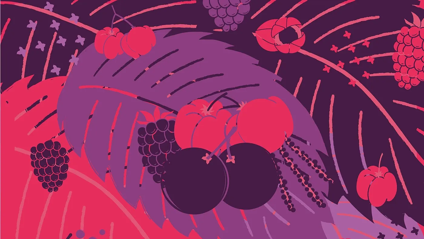
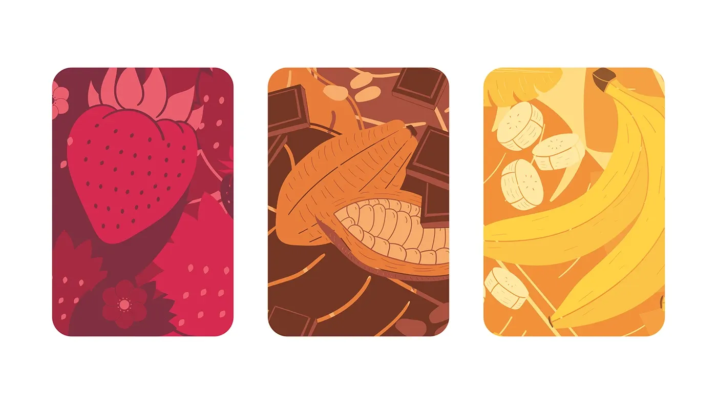
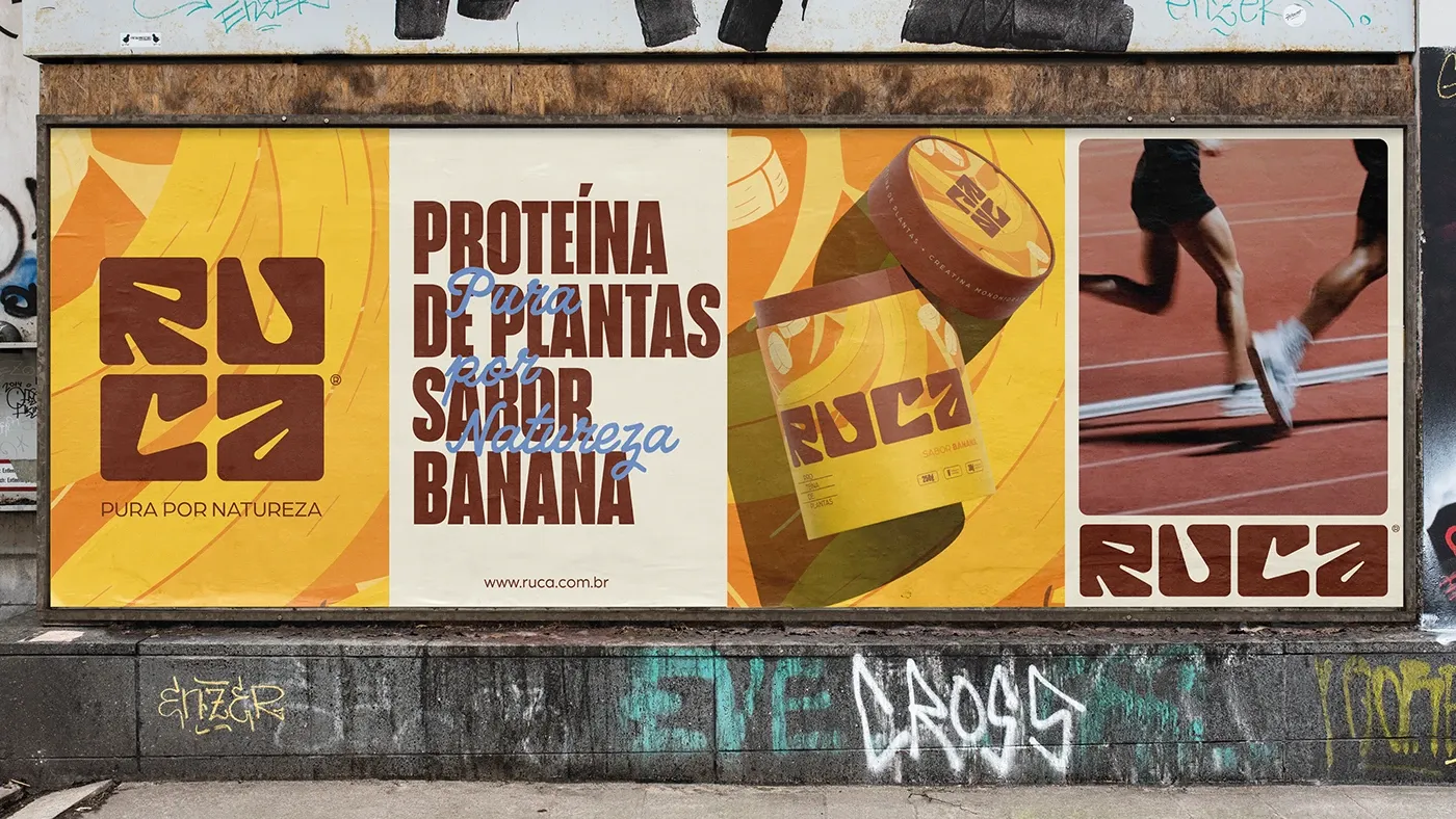
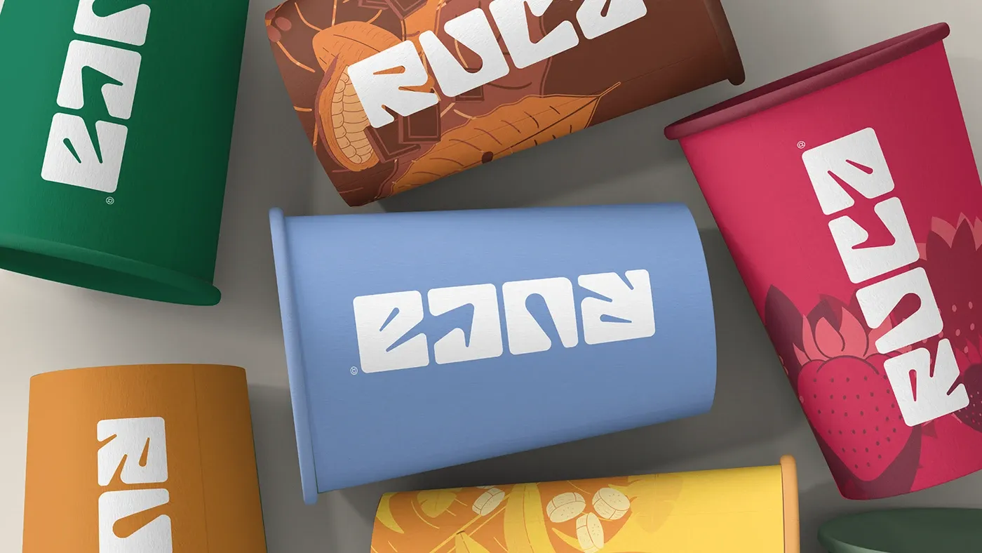
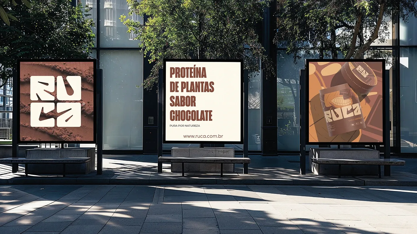
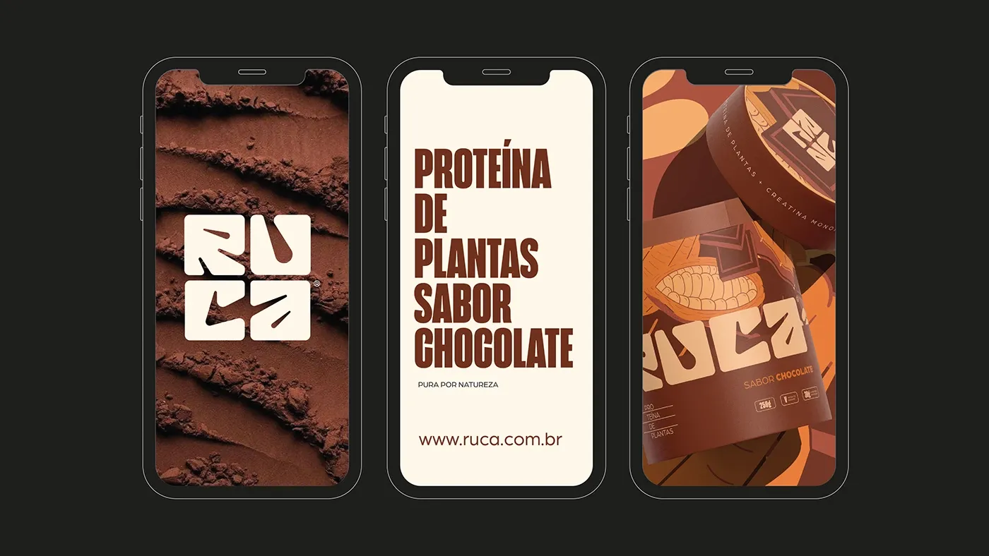
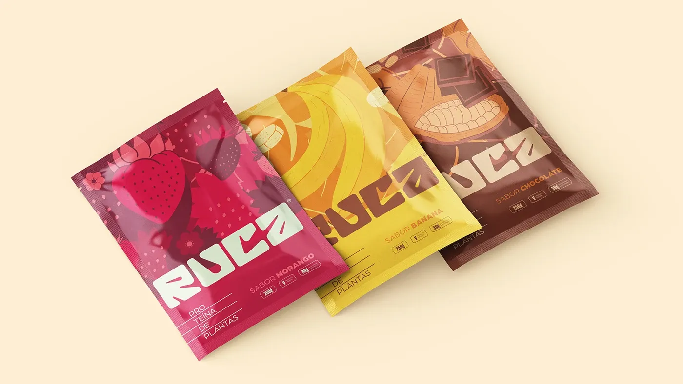
Fruits, leaves and seeds became a flat illustration system, with one flavor, one color and one pattern per product. Bold, compact lettering keeps the brand readable on a small sachet and loud on a billboard.
- Role
- Visual identity, illustration, packaging
- Project
- Plant protein · 2026
Designed at Capuan Brand Studio