Métrica Viabilidade
Métrica works between investors and the public sector, finding the technical and legal path for projects to move forward. It is neither a law firm nor a consultancy, so the brand presents it as a category of its own.
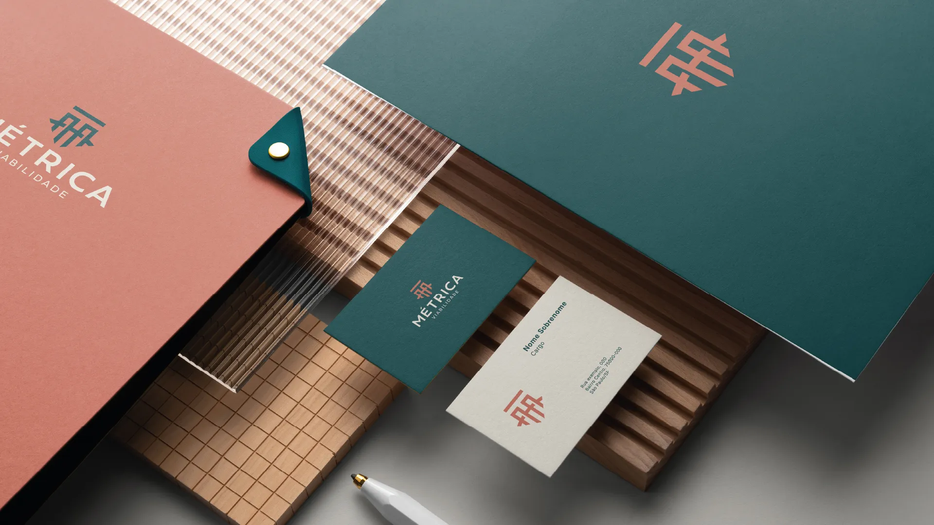
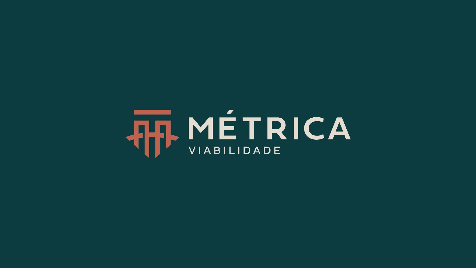
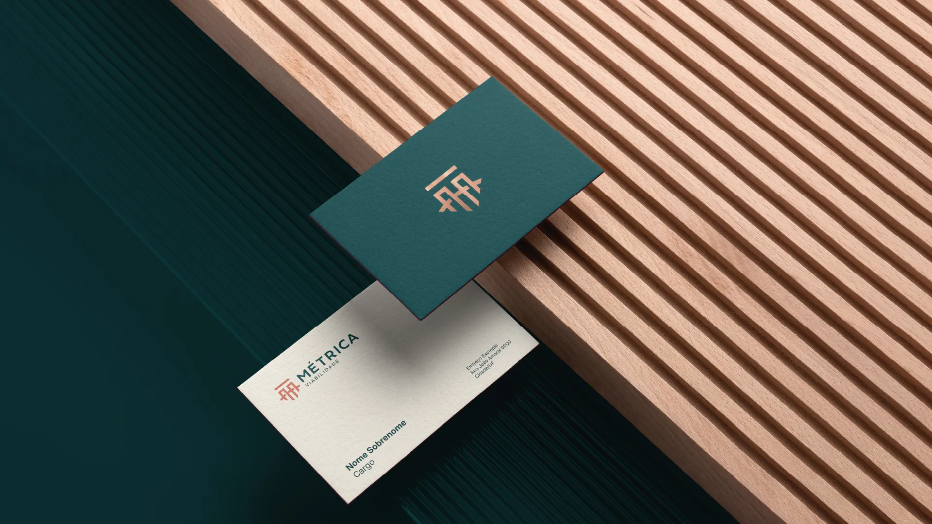
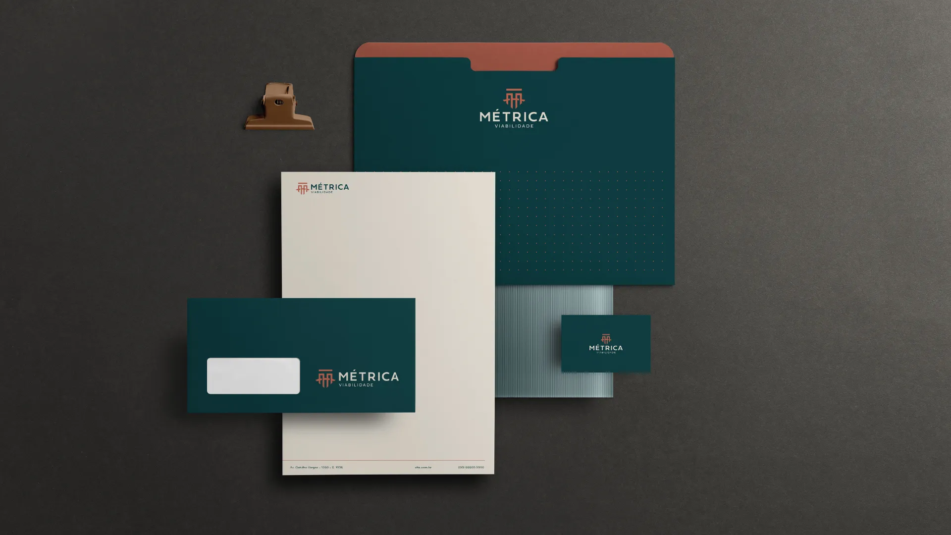
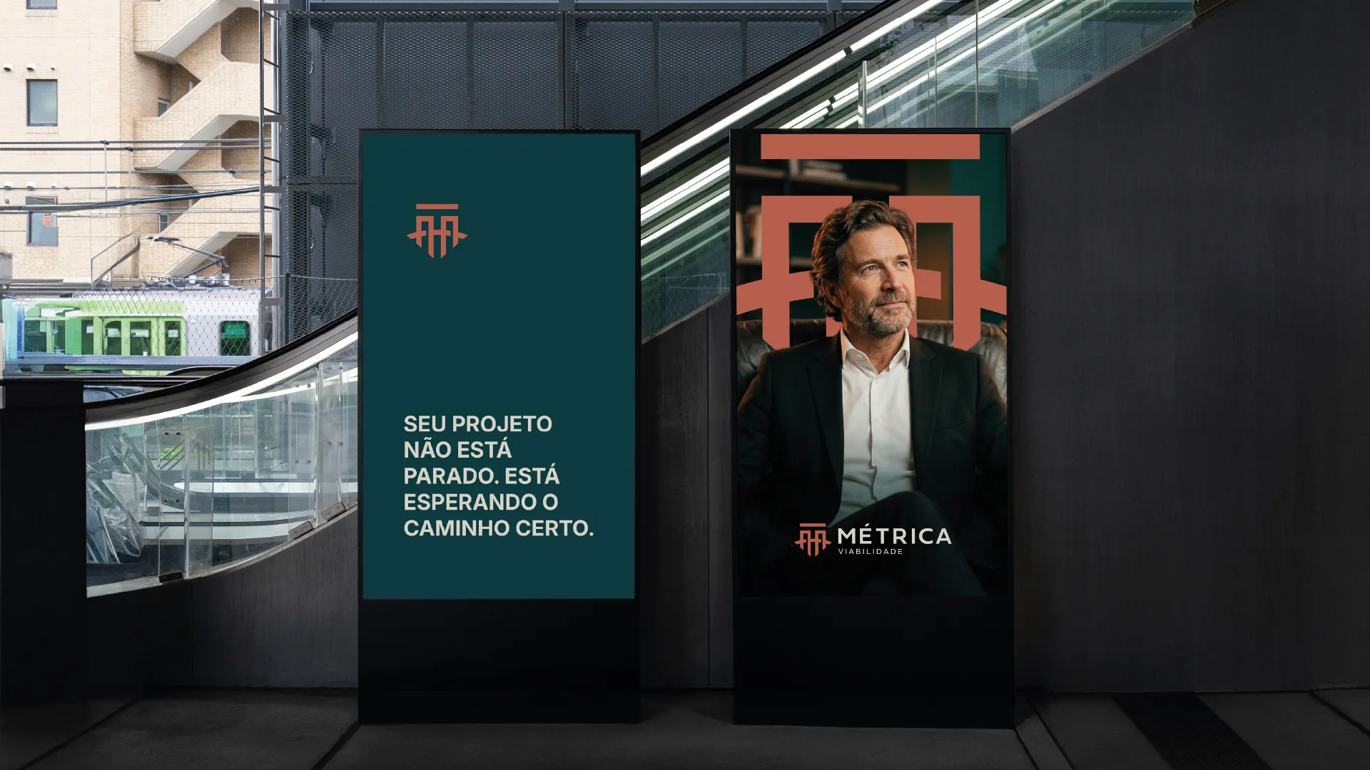
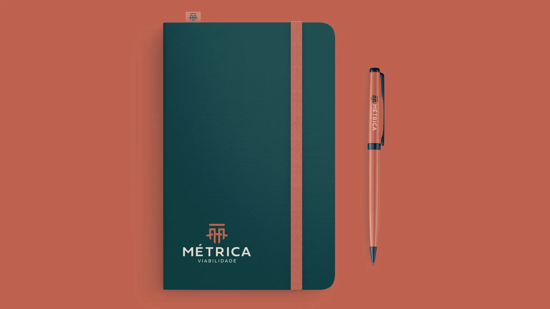
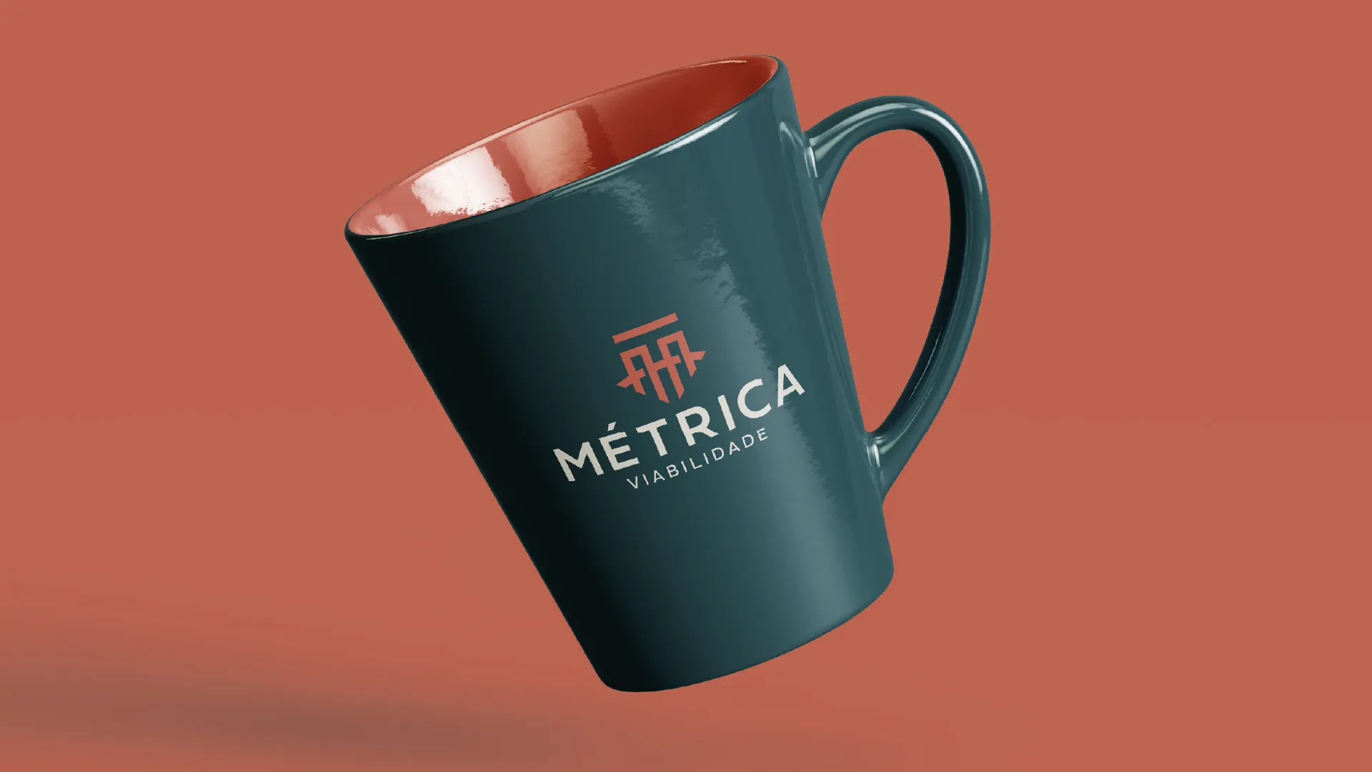
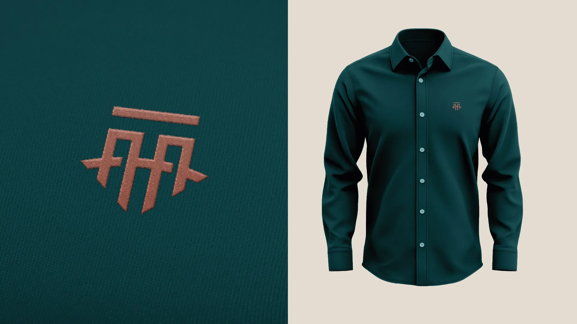
The symbol grows from the letter M and carries four ideas: a bridge between public and private, a pillar, a shield and an arrow pointing the way. Petrol green brings seriousness, and terracotta keeps it from feeling cold.
- Role
- Brand strategy, visual identity
- Project
- Institutional engineering · 2026
Designed at Capuan Brand Studio